


Recently updated on July 22, 2026
Fintech UX design trends in 2026 extend well beyond color palettes and animation. It all comes down to how much a user trusts a product to keep using it, whether it’s during onboarding, a large transfer, a declined payment, a frozen account, or a dashboard full of numbers.
There are dozens of specific points in a financial product where trust can be built or broken, and each one has real design weight.
Two distinct things matter: fintech UX design trends, which shape how a person moves through a financial decision, and fintech UI design trends, which shape how that decision looks and feels on screen. Search for either one and it often gets grouped together as UX/UI design trends 2026 fintech, but treating them as a single thing blurs where each actually applies.
Trust, compliance, and decision clarity have become core UX requirements in their own right, built into the product from the start. Fintech product design in 2026 has to hold up under regulatory scrutiny and still feel as easy as a consumer app.
Below, we cover UX and UI as separate threads, and give product teams a way to prioritize which trends matter for their stage of growth.
- 01Key Takeaways
- 02UX vs UI: What’s the Difference
- 03Why UX Design Is Changing in 2026
- 047 Fintech UX Trends to Watch
- 055 Fintech UI Trends to Watch
- 06What This Means for Product Teams
- 07Measuring the Business Impact
- 08Lessons From Our Own Builds
- 09Common Mistakes to Avoid
- 10How to Prioritize These Trends
- 11Final Thoughts
- 12FAQ
Key Takeaways
- AI is moving from a chatbot feature to an experience layer that shapes onboarding, advice, and support end to end.
- Trust in fintech UX design comes from predictable product behavior more than decoration.
- Compliance and accessibility are becoming part of the design system itself, ahead of the final QA pass.
- Dashboards are shifting from data density to decision clarity.
- Personalization works best when it leaves the user in control of the outcome.
- Accessibility and financial literacy are turning into growth levers alongside their role as legal obligations.
Fintech UX vs UI Design Trends: What Is the Difference?
Fintech UX trends and UI design trends are inseparable in a financial product. But they solve different problems.
What Fintech UX Design Trends Change
UX trends define the logic of a financial scenario: how a user starts a task, what they need to know before committing, and what happens when something goes wrong. This covers onboarding, KYC, authentication, decision-making, support, personalization, accessibility, and error recovery.
For example, take a money transfer flow that hides the fee until the confirmation screen. That’s a UX problem, not a visual one.
What Changes on the UI Side
UI trends define how that scenario is represented on screen: visual hierarchy, dashboards, typography, color, components, charts, feedback states, and interaction patterns. This is where fintech UI design trends 2026 show up most visibly. For example, dark mode toggles, adaptive dashboards, and microinteractions.
UI is what the user sees; UX is what the user understands.
Why Fintech UX and UI Must Be Designed Together
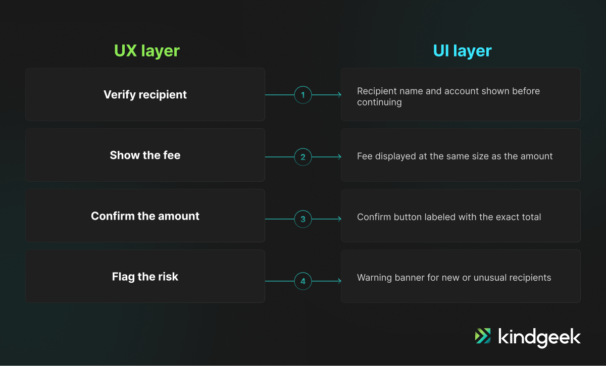
Take a money transfer. UX defines the logic: verify the recipient, show the fee, confirm the amount, flag the risk. UI renders that logic: where the fee sits on screen or how the risk warning is styled.
A beautiful UI rarely compensates for a flow that asks the wrong question at the wrong time. At the same time, a correct flow can still fail if a fee is buried in gray 10px type.
Why Fintech UX Design Is Changing in 2026
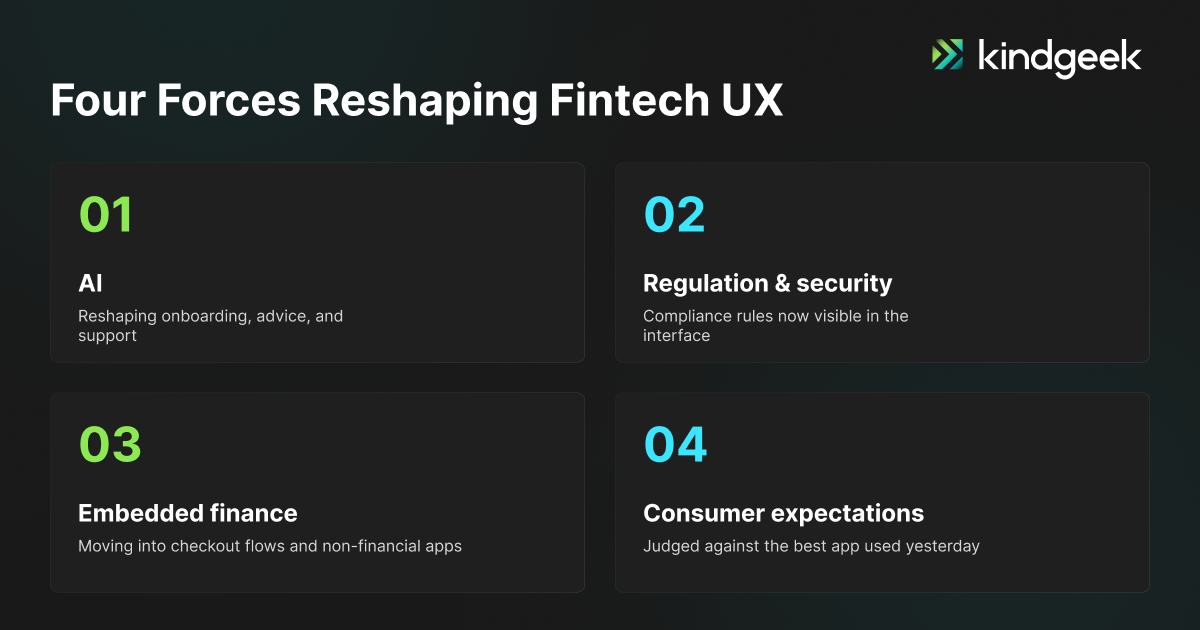
Four forces are reshaping fintech UX design trends this year: AI, regulation, embedded finance, and rising user expectations, all part of a broader shift toward fintech app design trends.
AI Is Becoming a Part of the Experience
Bank of America’s Erica shows what that looks like: launched in 2018 as a basic navigation assistant, it now delivers proactive, personalized guidance throughout the banking relationship. This includes pending alerts, bill reminders, security flags, and financial planning nudges.
By early 2026, Erica had logged more than 3.2 billion client interactions since launch, with 20.6 million users engaging it in 2025 alone. That’s AI running through the everyday financial experience itself.
Regulation and Security Become Visible Product Elements
PSD3 and the new Payment Services Regulation cleared a political agreement between the European Parliament and Council in late 2025 and are working through formal adoption in 2026, with strong customer authentication and fraud-liability rules that will show up directly in transaction UI. Compliance has become a visible part of the interface itself.
Embedded Finance Is Expanding UX Contexts
Gartner projects that by 2026, more than half of consumer financial transactions will originate on third-party digital platforms rather than a bank’s own app. That means fintech UX now has to perform inside checkout flows, marketplaces, and SaaS tools that sit outside a bank’s direct control.
Consumer-App Simplicity Meets Financial-Grade Trust
People judge a banking app against the best app they used yesterday, even if it was a food delivery app or a rideshare app. At the same time, that person expects predictable behavior in high-stakes moments like declined payments or frozen accounts. Everyday polish and reliability under pressure both define the bar for financial products now.
Top 7 Fintech UX Design Trends in 2026
1. Explainable AI Copilots Replace Generic Financial Chatbots
Generic chatbots are giving way to copilots that give contextual financial guidance. For example, they are able to flag an unusual spending pattern, suggest a savings move, or explain why a certain transaction was flagged.
The difference in 2026 is explainability. A good AI suggestion shows its reasoning, gives the user a way to override it, and connects them to a human agent when the situation asks for it.
Regulators are pushing in the same direction. The EU’s AI Act classifies many financial-services AI use cases as high-risk, which brings explicit transparency obligations (European Commission, 2026).
Why it matters in fintech: Financial suggestions carry real consequences, so a visible reason builds more trust than the suggestion alone.
Product example: A flagged transaction that names the specific pattern behind the flag, with a one-tap way to dismiss or confirm it.
Implementation risk: An override buried in a settings menu instead of next to the suggestion defeats the purpose of explainability.
2. Decision-First UX Replaces Feature-Dense Dashboards
Instead of surfacing every metric at once, decision-first UX uses progressive disclosure to show what matters for the task at hand, then lets the user drill into detail from there. This means intent-based navigation, a reduction in cognitive load, and next-best-action prompts instead of a wall of static numbers.
Instead of chopping features, the goal is to sequence them so that fewer things are vying for the user’s attention.
Why it matters in fintech: A user acting under time pressure needs the one relevant action, not a full menu of what the product can do.
Product example: A homepage that leads with the one bill due this week, instead of a grid of balances, history, and settings shortcuts.
Implementation risk: Progressive disclosure can tip into hiding features users need often, adding extra taps to routine tasks.
3. Trust Is Designed Through Transparent System Behavior
Trust is one of the fintech UX design trends for 2026 which comes from predictable, visible system states: clear transaction status, upfront fees, realistic processing-time estimates, unambiguous confirmations, and a straightforward path to reverse a mistake.
A system that fails predictably and explains what happens next tends to build more trust than one that hides errors from view.
Why it matters in fintech: A user who can’t tell why a payment is delayed tends to assume something went wrong, even when it didn’t.
Product example: A transfer status screen that names the actual step, like verifying with the recipient’s bank, instead of a generic spinner.
Implementation risk: Surfacing raw technical detail can read as alarming rather than reassuring; the goal is plain language, not a system log.
4. Adaptive KYC and Risk-Based Authentication Reduce Unnecessary Friction
The EBA and ECB’s joint 2025 Report on Payment Fraud found that card transactions without strong customer authentication (SCA) had fraud rates twice as high as authenticated ones within the EEA, rising to three to four times higher outside it. That gap is the argument for risk-based, adaptive authentication: apply stronger checks where risk is real, and lighter ones where it’s genuinely low.
Adaptive KYC follows the same logic, matching verification depth to actual risk: progressive document upload, biometrics, behavioral signals, and trusted-device recognition, with step-up authentication triggered only when risk actually changes. Explaining why a step is needed, in plain language, and at the moment it’s requested, measurably reduces drop-off.
Why it matters in fintech: Blanket friction loses legitimate users just as often as it stops fraud, so matching the check to the actual risk protects both conversion and security.
Product example: A returning verified user skips document re-upload; a first large transfer triggers one extra check.
Implementation risk: A step-up check triggered by the wrong signal, like a normal network change, creates friction for legitimate users instead of catching real risk.
5. Embedded Finance Creates an Invisible but Reassuring UX
Payments, lending, insurance, and BNPL increasingly show up inside non-financial products, like a checkout flow or a delivery app. That creates a brand handoff problem: the user needs to recognize the actual provider behind the offer, understand the terms they’re accepting, and know where responsibility sits if the transaction goes wrong.
Embedded finance UX succeeds when it fades into the host product’s flow, while responsibility for the user’s money stays clear throughout.
Why it matters in fintech: A user who can’t tell who they’re borrowing from or paying is less likely to trust the offer at all.
Product example: A checkout BNPL option that names the lending partner and shows repayment terms before the user commits.
Implementation risk: Minimizing the handoff too far to keep the flow seamless can leave the user unsure who to contact if something goes wrong.
6. Accessibility and Financial Literacy Become Core Product Features
The European Accessibility Act has applied to banking and payment services since June 28, 2025, and WCAG 2.2, now the ISO/IEC 40500:2025 international standard, added criteria directly relevant to financial UIs, including accessible authentication and minimum target sizes for tap controls. In practice this means screen-reader support, accessible charts, inclusive form design, and plain-language explanations of APY, fees, risk, and interest sitting next to the numbers themselves.
Why it matters in fintech: Fees, APY, and risk disclosures only protect the user if they’re understandable at a glance, not just legally present.
Product example: An APY figure with a one-line plain-language definition next to it, instead of a separate glossary page.
Implementation risk: Treating accessibility as a legal checklist instead of a design requirement tends to produce compliant but unusable screens.
7. Responsible Gamification Focuses on Progress, Not Risk-Taking
Savings goals, progress bars, and educational challenges still work well for building good financial habits. What’s changing is where fintech teams draw the line: gamification mechanics belong on savings and budgeting. Trading and borrowing decisions call for a steadier hand, since the same reward loops can push users toward impulsive decisions there. Some fintech products now build in a short pause before a risky action goes through like a confirmation step or a brief cooling-off screen.
Why it matters in fintech: The same reward loop that builds a savings habit can push a user toward an impulsive trade or loan.
Product example: A confirmation pause on a large trade, styled distinctly from the celebratory animation on a savings goal.
Implementation risk: Applying identical gamification mechanics across every product area, regardless of risk level, undoes the safeguard.
Top 5 Fintech UI Design Trends to Watch in 2026
Fintech app UI design trends 2026 focus on streamlining financial data legibility and removing financial status ambiguity.
1. Data Storytelling Replaces Static Financial Charts
More and more charts come with a plain-language explanation right next to them that tells the user what changed and what to do next, instead of leaving the user to interpret the chart alone. Contextual benchmarks and trend lines over time turn a static chart into a usable insight rather than a wall of numbers.
Why it matters in fintech: Financial charts carry decisions, not just information, and a misread trend under time pressure can lead to a real financial choice.
Product example: A spending chart that flags a category-level increase versus last month, right next to the line.
Implementation risk: Auto-generated annotations can misfire on edge cases, like a one-off large transfer, and mislabel a normal month as an anomaly.
2. Adaptive Dashboards Show Less but Explain More
Role-based dashboards change which sections appear based on what the user actually does. A consumer dashboard surfaces different information than a treasury dashboard built for a business user, and both use progressive disclosure to keep the first screen light while more detail stays one click away.
Why it matters in fintech: A single layout tends to either overload a casual user or under-serve a power user managing multiple accounts.
Product example: A treasury dashboard opens on cash position and approvals; the same platform opens a personal account on balance and recent activity.
Implementation risk: Maintaining several role-based layouts can fragment the design system if each view is built as a one-off screen.
3. Fintech Design Systems Embed Compliance and Accessibility
It is becoming more and more common for design systems to include design tokens, reusable parts, disclosure patterns, and data-masking states. That makes auditability and accessibility the norm instead of an afterthought. This is especially important for white-label products, where every branded tenant needs to use the same set of tokens to stay compliant.
Our own FinKit toolset for white-label fintech app development is built around exactly this principle: one design-token architecture that helps teams apply approved accessibility and compliance patterns consistently across multiple brands.
Why it matters in fintech: A white-label product multiplies the cost of any compliance or accessibility gap across every branded tenant.
Product example: A shared token set that pushes an updated disclosure pattern to every brand at once, instead of per-brand fixes.
Implementation risk: A token system without governance drifts as teams add one-off overrides per brand, quietly recreating the duplication it was meant to prevent.
4. Accessible Color, Typography, and Dark Mode Replace Purely Decorative Visual Trends
Financial interfaces are moving past color and type choices made for looks alone. Contrast ratios get checked for both light and dark themes, tabular numerals keep currency columns aligned, and gains or losses stop relying on red and green alone, since a shape or explicit sign carries the same meaning for colorblind users.
The same logic covers charts and status states: dark-mode palettes get their own contrast pass instead of an inverted light palette, and error or warning states carry a visible label, not just a color change.
Why it matters in fintech: Misreading a gain as a loss, or missing a warning that relied on color alone, isn’t just an accessibility gap, it’s a financial mistake.
Product example: A declined transaction shown with a labeled icon and outline, not red text alone.
Implementation risk: Teams that treat this as a dark-mode reskin often ship a palette that fails once real data, long numbers, negative values, multiple currencies, gets dropped in.
5. Purposeful Microinteractions Make Financial Actions Feel Predictable
Indicators for transfer progress, loading and pending states, and confirmation animations are increasingly built to show exactly what the system is doing, rather than just looking polished. A reversible action that’s clearly labeled as reversible does more to reduce user anxiety than any animation.
Why it matters in fintech: A large transfer is exactly when a user is most anxious about whether it went through, and a real status update prevents that anxiety from turning into a support ticket.
Product example: A payment confirmation screen that shows distinct processing, sent, and failed states, each with its own icon, instead of one generic spinner.
Implementation risk: Motion that isn’t tied to a real state change, like a spinner running regardless of actual processing time, trains users to distrust the indicator.
What These Fintech UX and UI Trends Mean for Product Teams
Deciding which fintech UI UX design trends to act on in 2026 starts with one question: what does your product actually need right now?
Prioritize by user risk over visual novelty. A trend that looks impressive in a portfolio earns its place mainly when it also reduces risk or friction for actual users.
Build compliance into UX. Most of the time, it costs more to add disclosure and audit requirements to a product that has already been shipped than to design around them from the start.
Design the high-anxiety moments first. Onboarding, identity verification, large transfers, declined payments, frozen accounts, investment losses, and payment reversals are where users are most stressed and most likely to churn if the UX fails them. These moments benefit from early attention.
Use a design system before scaling. A lot of the time, teams that try to start a white-label or expand a product before they have a documented design system end up having to rebuild the same compliance and accessibility logic screen by screen. Our approach to fintech design systems starts with an audit of exactly this kind of duplicated logic before writing components.
How to Measure the Business Impact of Fintech UX
Here’s how to gauge whether these fintech UX trends are actually working for your product.
- Onboarding and KYC metrics: completion rate, step-level drop-off, document resubmission rate, time to verified account.
- Transaction and task-success metrics: task completion rate, failed transaction rate, reversal rate, time to complete, repeated attempts.
- Trust, support, and retention metrics: support contacts per transaction, account abandonment, feature adoption, repeat usage, customer satisfaction, retention.
- Accessibility and usability metrics: task success across user groups, keyboard and screen-reader completion rates, usability test results, accessibility defects, comprehension rate.
Teams that only track metrics for conversions often miss the signs of trust and accessibility that show when a customer is likely to churn.
How Kindgeek Applies These Fintech UX and UI Trends
The examples below reflect patterns from Kindgeek’s product design work across fintech and BaaS engagements.
Example 1: AI-Guided Financial Decision-Making
Users often ignore automated savings suggestions because they can’t tell why the app is making them. In moderated usability sessions on one digital banking product, adding a one-line explanation next to each suggestion, along with a clear override option, made users noticeably more willing to accept the recommendation instead of dismissing it outright.
The lesson: an AI recommendation paired with a reason earns far more trust.
Example 2: Progressive KYC and Trust-First Onboarding
Requiring full verification upfront tends to filter out users before they’ve seen any value. That’s why we split KYC into stages: basic identity to open a limited account, full verification only once transaction volume crosses a threshold. In post-launch usage data, more users reached an active account under the staged flow, since most could start using the product before facing the heaviest verification step.
The lesson: front-loading every compliance requirement tends to filter out users before they’ve seen any value.
Example 3: Decision-Focused Financial Dashboard
A dense grid of metrics leaves users guessing what to do next. For wealth-management products, we replace that with a role-based summary showing just the numbers that matter most that week, plus a next-best-action link. Following that kind of redesign, support requests asking what to do next tend to drop off, since the dashboard answers that question by design instead of leaving it to the user.
The lesson: A dashboard that shows less but explains more earns its keep in reduced support load.
Example 4: Scalable White-Label Fintech Design System
Rebuilding compliance disclosures and accessible components for every new brand adds up fast. For BaaS platforms supporting multiple bank-branded tenants, we consolidate these into a shared, tokenized design system instead. Once that kind of token system is in place, launching each additional branded tenant tends to take noticeably less engineering time than a brand-by-brand rebuild, since branding becomes a configuration step rather than a new build. We use this approach for our white-label fintech engagements.
The lesson: A shared design-token architecture turns brand rollout into a repeatable process instead of a one-off engineering project.
Common Mistakes When Applying Fintech Design Trends
- Copying visual trends while leaving the user flow untouched. A dark-mode redesign carries limited value if the underlying transfer flow still hides the fee.
- Using AI ahead of explainability and user control. An AI suggestion the user can question and override tends to build more trust than one they simply have to accept.
- Hiding financial complexity instead of explaining it. Simplifying a screen by removing the fee disclosure creates a compliance problem.
- Gamifying high-risk financial actions. Reward mechanics that work well for a savings goal can actively harm users when applied to trading or borrowing decisions.
- Pushing accessibility and compliance to the final QA stage. Both tend to be cheaper and more effective as part of the design system from day one.
How to Prioritize Fintech UX Design Trends for Your Product
| Product Stage | Priority Order |
|---|---|
| New fintech product | Onboarding, trust signals, basic information architecture, design system, accessibility |
| Scaling fintech platform | Personalization, modular dashboards, product discovery, design-system governance, localization |
| Bank modernizing a legacy product | Simplification, gradual redesign, system-status visibility, legacy integration, cross-channel consistency |
| White-label fintech platform | Design tokens, reusable components, multi-brand theming, configurable compliance, role-based UX |
Conclusion
Looking at the fintech UI UX design trends 2026/2027 outlook as a whole, they point in one direction: clarity, control, and trust matter more than visual novelty. UI works best when it explains a financial decision, beyond just displaying the data behind it. AI works best when it helps a user decide, with a visible explanation supporting that choice. Design systems benefit from carrying compliance and accessibility as defaults, so they scale across features and brands with less rework.
Each trend suits some products more than others. The right starting point depends on whether you’re launching, scaling, modernizing, or white-labeling.
Looking for a fintech product design partner?
Kindgeek works with fintechs, banks, and BaaS providers on exactly this kind of product design and fintech software development work. If you’re weighing which of these fintech UX design trends actually apply to your product, or want to see FinKit in action, let’s talk.
Contact us →Which metrics should teams use to measure fintech UX?
Onboarding completion rate and step-level drop-off, transaction success and reversal rates, support contacts per transaction, retention and feature adoption, and accessibility metrics like screen-reader task completion. Tracking only conversion metrics tends to miss the trust and accessibility signals that predict churn later.
How can fintech companies balance security and usability?
Risk-based, adaptive authentication is the current answer: applying stronger verification only when a transaction or behavior pattern actually signals higher risk, rather than applying the same friction to every user regardless of context. Explaining a security step at the point it’s requested, also reduces drop-off without weakening the check itself.
How is AI changing fintech UX design?
AI has moved from a standalone chatbot feature to an experience layer that touches onboarding, advice, fraud flags, and support. The direction in 2026 is toward explainability: showing the reasoning behind an AI suggestion, letting users override it, and providing a clear escalation path to a human when needed.
What is the difference between fintech UX and UI design?
UX design defines the logic of a financial task: what a user needs to know, decide, and confirm. UI design defines how that logic appears on screen: layout, color, typography, and component states. Fintech products need both working together, since a well-designed flow can still fail if the UI hides critical information like fees or risk warnings.
What UI trends matter the most for fintech in 2026?
Data storytelling that explains charts instead of just displaying them, adaptive role-based dashboards, design systems that embed compliance and accessibility by default, accessible color and typography including dark mode, and microinteractions that communicate system state rather than decorate the screen.
What are the biggest fintech UX design trends in 2026?
Explainable AI copilots, decision-first dashboards that replace feature-dense screens, transparent system behavior as the basis for trust, adaptive KYC that scales friction to actual risk, embedded finance UX, accessibility as a core feature rather than a compliance checkbox, and responsible gamification are the fintech UX design trends shaping products this year.